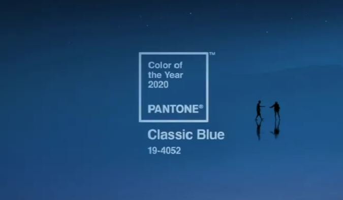
CULTURE

Pantone Anounces Shockingly Political Choice for Their 2020 "Color of the Year"

No one expected an endorsement of Bernie Sanders... And also, no one else noticed it

Image edited to reflect author's perspective

Screenshot via Instagram

In a stunning revelation, Pantone shed their usual apolitical stance and used their 2020 "Color of the Year" announcement to all-but-explicitly endorse Bernie Sanders' candidacy for president.

Widely known for providing color standardization for graphic design and fashion, Pantone took a risk—in an era when many people deride the politicization of previously non-partisan activities—by announcing "Classic Blue" for 2020. Breaking from traditional, non-partisan colors like 2019's Living Coral, they veered past centrist choices like "Calm Blue," or "Amtrak Blue" to boost the "Classic Blue": a clear nod to the New Deal Democrat approach of Bernie Sanders.


While Pantone didn't mention Bernie Sanders, or any other candidate—or any political issues whatsoever—in their announcement, it's not hard for a politically obsessive weirdo like me to read between the lines and find hidden messages throughout. Allow me to guide you through their sly endorsement of the Senator from Vermont.

Classic Blue, also known as Pantone 19-4052—even this numerical code references the 1940-52 FDR-Truman era of robust social programs and high taxes on the wealthy— is described as "timeless and enduring hue elegant in its simplicity." Pantone further claims that it "highlights our desire for a dependable and stable foundation on which to build as we cross the threshold into a new era." This perfect summation of both the New Deal vision and Bernie Sanders consistent approach to policy over the last four decades encapsulates Pantone's recognition that while Sanders is perceived as "radical" from the perspective of Clintonian neoliberals, he actually represents a return to old school Democratic values that have been systematically stripped out of American politics since the 1970s.

Unlike many candidates—and colors—that would have us focus on the suffocating limitations of the status quo, Bernie and Classic Blue both point to "the vast and infinite evening sky [which] encourages us to look beyond the obvious to expand our thinking; challenging us to think more deeply, increase our perspective and open the flow of communication." And while many candidates—and colors—have allowed the shifting winds of public opinion to dictate their positions, we can look to Bernie and Classic Blue for the "constancy and confidence that is expressed by Pantone 19-4052 Classic Blue, a solid and dependable blue hue we can always rely on,"


American Horizon | Bernie Sanderswww.youtube.com


In recent decades, we've taken it in stride that even "progressive" politicians will lie to us, make cuts to social programs that people rely on, and maintain America's militaristic approach to foreign policy. Bernie represents a shift from that form of politics, which is why he's gained so much popularity in this era of turmoil. In times like these, according to Pantone, "it is easy to understand why we gravitate to colors that are honest and offer the promise of protection. Non-aggressive and easily relatable, the trusted PANTONE 19-4052 Classic Blue lends itself to relaxed interaction."

In case the message wasn't clear enough, at the unveiling event Pantone provided accompanying sensory experiences to represent the spirit of "Classic Blue" including a "soft velvety texture,"—not unlike a smooth Bernie—and a soundscape that captures "vivid nostalgia." Ahem.

With Pantone's endorsement now in the bag for Bernie, expect the other candidates to begin jockeying for the coveted Crayola seal of approval.