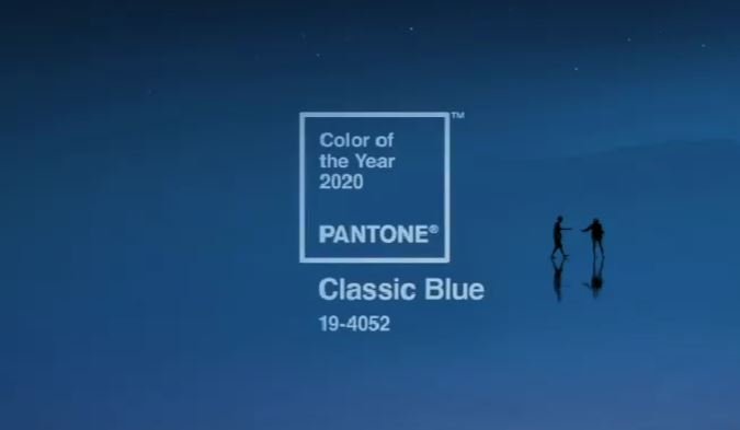
CULTURE Pantone Anounces Shockingly Political Choice for Their 2020 "Color of the Year" Keith Baldwin 05 Dec, 19 No one expected an endorsement of Bernie Sanders… And also, no one else noticed it
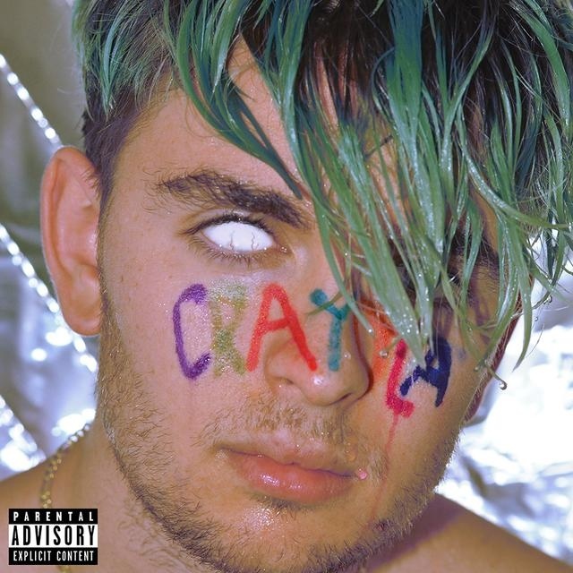
Music New Dwilly EP is a Vibrant Swirl of Colors Dustin DiPaulo 15 Mar, 19 On Crayola, Dwilly showcases his many talents.
